I'm Michal known as 'Mike De Pal' in the video editing and social media space.
Nowadays, I do mostly video editing for long-form talking head videos in the business/marketing space.
a brand and digital designer obsessed with contrast, clarity, and details that most people never notice but always feel. Over the past years I've helped startups, creators, and established brands move from "we look like everyone else" to "this finally feels right".
My work sits at the intersection of visual identity, product thinking, and storytelling. I focus on lean, high-impact engagements: clear goals, sharp concepts, and efficient collaboration. No big-agency layers — you work directly with the person who designs everything.
SKILLS
Brand Identity • Product Design • UI/UX • Packaging Design • Art Direction • Figma • Photoshop


EXPERIENCE
Freelance
Afterglow Studio
Brand Designer
UrbanFit Collective
Visual / Packaging Designer
GreenK Goods
Currently
2023–24
2020–22
ABOUT ME
Video Editor & Content Strategist
My most recent project
A series of educational videos for a capital management company Larsen Capital https://go.larsencp.com/. The project was aimed at an older audience, maintaining a clear, professional style that emphasized value and delivery.


Other YouTube Projects
Portable Music Player
Product Design • UI/UX • Brand Guidelines
A tactile, almost analog-feeling product identity for a digital-first brand. Clean product renders, precise iconography, and a flexible layout system for web, print, and packaging.
Dune Devices wanted to bring back the joy of focused listening in an age of distraction. Their portable music player needed a brand identity that honored analog tactility while embracing digital precision. I built a system around geometric simplicity, restrained color (black, white, one accent), and ultra-clear iconography. The identity translated seamlessly across contexts: sleek product renders for their site, embossed packaging details for retail, and modular UI components for their app interface. I also developed a comprehensive brand book and asset library so their internal team could maintain visual consistency as they scaled. The result feels intentional, timeless, and refreshingly un-tech-bro.


2026


Vertical Instagram Reels
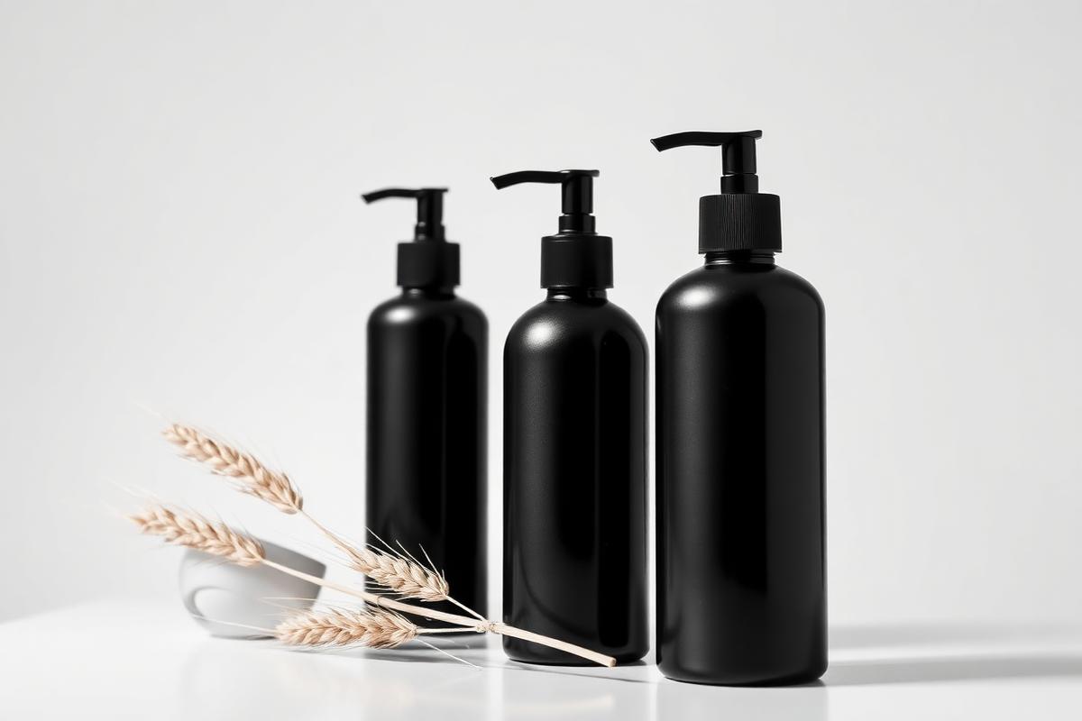
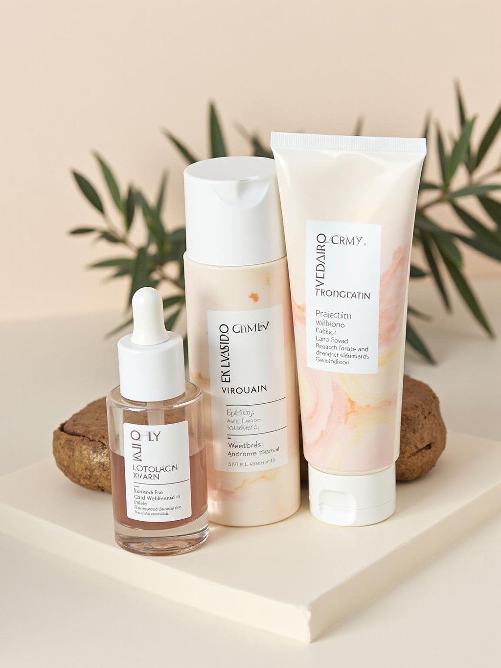
Soft Essentials Line
Brand Identity • Photography • Packaging Design
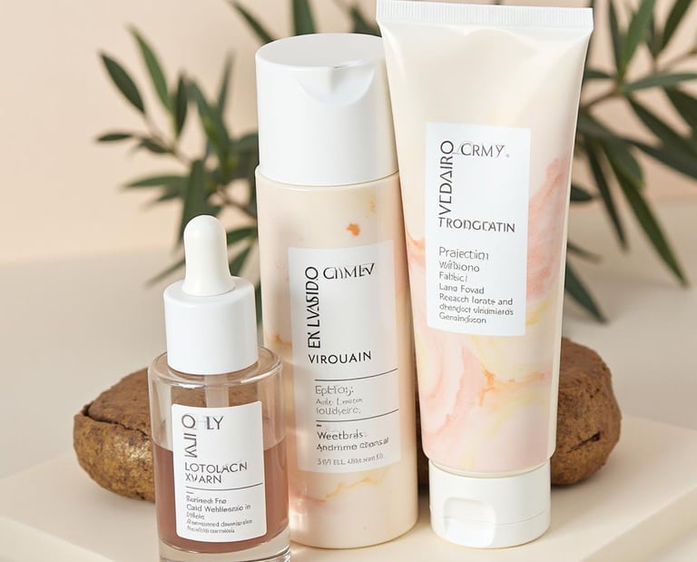
Subtle, light-driven photography and a quiet typographic system to position Opal as a calm, trustworthy skincare brand. Deliverables included logo, bottle labels, and e-commerce visuals.
Opal came to me with a clear ask: their skincare line was gentle, effective, and ingredient-focused, but their visual identity felt generic and overlooked. I redesigned everything from the ground up, starting with a new logotype that felt softer and more considered. The photography direction emphasized natural light and minimal styling—no aggressive shadows or clinical backdrops. I designed a label system that worked across multiple product formats (bottles, tubes, jars) while keeping a unified look. Typography was kept quiet and elegant, letting the imagery breathe. We also created a full suite of e-commerce assets, including lifestyle photography, product detail shots, and social templates. The rebrand helped Opal feel less like a commodity and more like a trusted ritual.
All work designed end-to-end by Afterglow Studio — strategy, visuals, and rollout.



Get in touch
Share with visitors how they can contact you and encourage them to ask any questions they may have.

100%
Satisfaction Rate & Job Success
60+
Projects Completed
3+
Years Of Experience

"Alex translated our messy ideas into a visual identity that actually reflects who we are. The process felt calm, clear, and surprisingly fast."
Jona Carter
Founder, EcoLux
"The new brand system changed how we show up in every pitch. Our deck finally looks as polished as the product we're selling."
Sofia Toms
Co-Founder, GreenK Studios
"We came in with an outdated logo and no guidelines. We left with a full toolkit that our whole team can use without second-guessing."
Richard Lee
Creative Director, UrbanRoots
CLIENT REVIEWS FROM UPWORK
Real feedback from clients I've worked with


STEP 1
Define the vision
We clarify your goals, audience, and what 'good' looks like for you. This gives us a shared direction before any design work begins.

STEP 3
Design the system
Logo, typography, colour, imagery, layouts — everything is built as a cohesive system so your brand looks consistent

STEP 2
Map the foundations
I translate the strategy into moodboards, references, and directions. You pick a path, and we refine it together

STEP 4
Apply and refine
We test the system on real assets: key pages, packaging, slides, or social content. Feedback is folded in until it feels just right.

STEP 5
Deliver and support
You receive organised files, usage guides, and templates. Need help rolling it out? I can stay involved as a design partner

SERVICES
What I can help you create
I work with brands at launch, rebrand, or "we've outgrown our look" moments. Projects are tailored, but most fall into these service areas:
Brand Identity
From logo to full visual language: typography, colour palette, layout rules, and brand guidelines that keep everything consistent and recognisable.

Digital & UI Design
High-fidelity web and product interfaces designed with clarity and usability in mind, ready for handoff to your development team.
Packaging & Print
Labels, boxes, inserts, and physical touchpoints that feel as considered as your product — including print-ready files and mockups.
Launch & Content Design
Social templates, pitch decks, campaign visuals, and ad creatives so your new identity shows up beautifully from day one.

Not sure where to start? Book a consultation to talk through scopes and timelines.
MORE WORK
Additional projects worth exploring
Nexus Labs
Tech Startup Branding
Brand Identity • Digital Design • Pitch Materials
Abstract geometric identity with bold typography for a developer tools company. Created logo system, digital guidelines, and pitch deck templates for Series A fundraising.
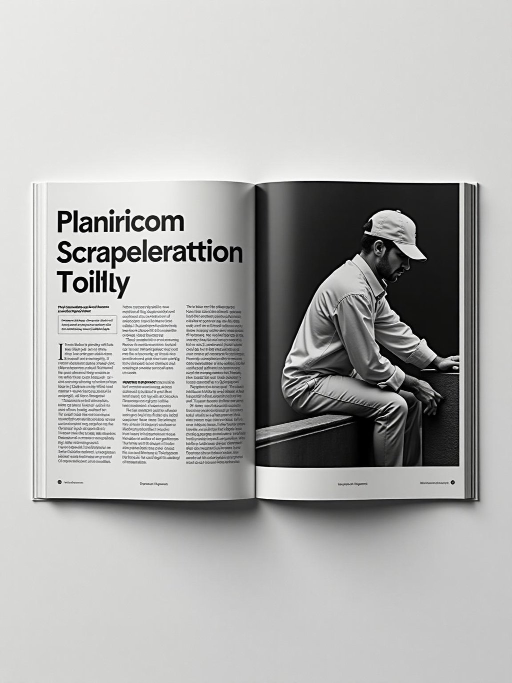
Canvas Magazine
Editorial Design System
Editorial Design • Typography • Layout Systems
Sarah specializes in digital product design and user research. She translates complex requirements into clean, intuitive interfaces that users actually enjoy.
Zenith Wellness
Luxury Spa Brand Identity
Brand Identity • Interior Design • UI/UX
Refined brand system with organic shapes and elegant typography for a premium wellness studio. Deliverables included signage, treatment menus, and digital booking interface.

LET'S WORK TOGETHER
Ready to give your brand its next chapter?
If you're planning a launch, a rebrand, or simply need a design partner who cares about the details, I'd love to hear what you're working on. Share a bit about your project and I'll get back to you with next steps.
Mike De Pal
Solo Video Editor & YouTube Strategist